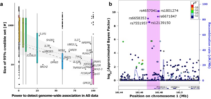
Fig 4. Fine-mapping the ankylosing spondylitis (AS) regions.
a) Correlation between predicted power to detect genome-wide association signals and size of the 95% credible sets. Boxplots represent the distribution of the simulations at the respective power of each RAF/OR setting. The labelled dots show the distribution of the empirical AS data. Regression lines in the range of predicted power of the AS loci (15–99.9%) are derived from the simulations (dashed) and AS loci (dotted with confidence interval of regression line). b) Example FCGR2A region where the 99% credible set (purple dots) could be fine-mapped to a small region (pink) containing few variant.

