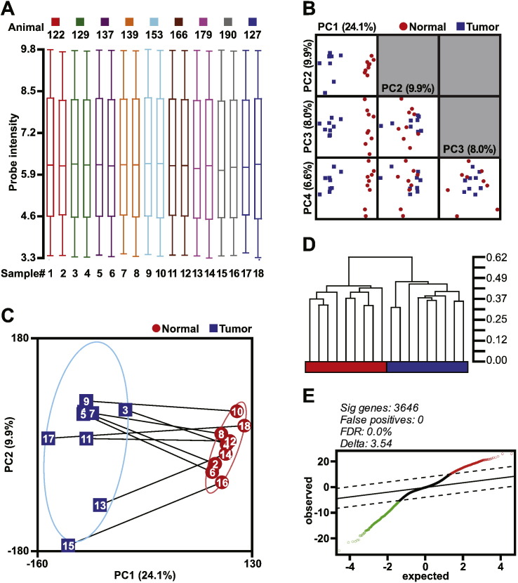
Fig. 2.
Data structure, unsupervised gene clustering, and differential gene expression analysis. (A) RMA normalized data distribution via box-whiskers plot with the upper and lower 10th percentiles represented by the whiskers. (B) Principal component analysis visualized via matrix plots of the first four principal components (PC). Four eigenvectors were calculated for PCA and data represented are scaled to unit standard deviation. (C) PC1 versus PC2 scatterplot with the microarray samples identified both by number and paired samples (lines). Confidence ellipses categorized by tissue type represent 2 standard deviations. (D) Unsupervised hierarchical clustering using Pearson's Dissimilarity matrix with average linkage. The scale for the dendrogram represents the distance of clusters by Pearson's correlation coefficient. The tissue classification is colored red and blue representing normal and tumor tissue classification, respectively. (E) Significance analysis of microarrays plot of observed scores plotted against the expected scores. The solid line represents observed = expected, whereas the dashed lines indicate the significance threshold based on Δ = 3.54. The genes identified as differentially expressed are indicated by red and green open circles, indicating higher and lower expression, respectively, of these genes in the mouse OCCC tumor tissue compared to normal ovaries. The number of differentially expressed genes, predicted false positives, and the false discovery rate (FDR) is provided.

