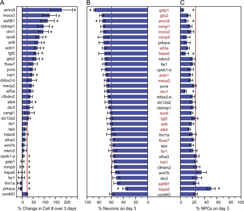
Fig. 8.
Morpholinos against candidate neurogenic genes generate a range of neurogenesis phenotypes. Summary of the in vivo imaging data showing the numbers of GFP-labeled cells generated over time (A), the proportion of the cells that were neurons (B) or NPCs (C) for each experimental condition. (A) The genes targeted with morpholinos are arranged by the magnitude of the change in cell number over 3 days. The asterisks indicate a significant decrease or increase compared to control morpholino conditions (red line). The mean values, SEMs and p-values are in Table 4. (B–C) The proportion of neurons (B) and NPCs (C) as a percentage of all cells counted on day 3. The genes targeted are listed along the y-axis and arranged by those that produced the greatest proportion of neurons. Asterisks indicate differences in the proportion of cell types between the experimental and matched control morpholino groups (Mann–Whitney U test, p <0.05). Gene symbols listed in red identify the morpholinos that resulted in a significant difference in the proportions of cell types compared to control (Pearson X-square test, p<0.05). The mean values, SEMs and p-values are in Table 2. Red lines on graphs indicate the mean control morpholino (conMO) values for the proportion of neurons or NPCs. The mean values, SEMs, and p-values are in Table 5.

