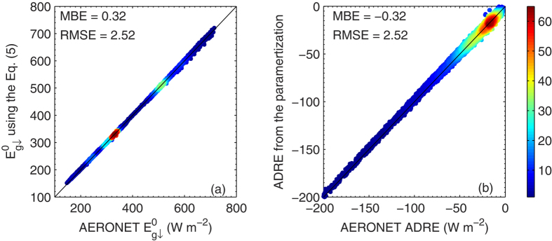
Figure 6. Density plot of AERONET (a)  and (b) ADRE and their parameterization results using Eqs (8).

The color scale represents the relative density of points, where orange to red colors (levels ~ 45-60) indicate the highest number density. The mean bias error and root-mean-square error of the parameterization are also included. The figure was produced using MATLAB.
