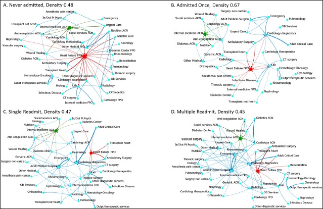
Fig. 1.

Visualization of the service to service Transition networks. Links are weighted by transition probability. Links with transition probability <0.10 were removed to improve clarity of the images. Red and green coloration is used to emphasize two clinical service nodes with high inverted betweenness and their adjacent links.
