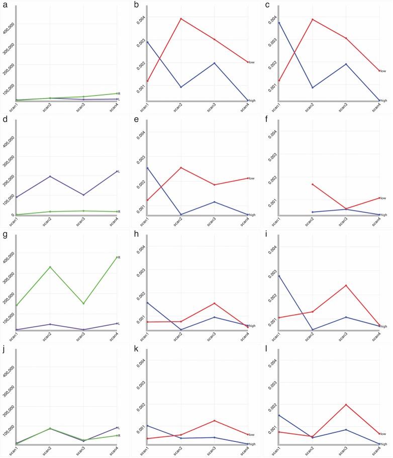
Fig 3. Line charts of Activation Extent and Intensity.
Each row represents a component (IC-1 (a-c), IC-2 (d-f), IC-3 (g-i) and IC-4 (j-l)). The first column represents changes in the extent of significant activation for the IC on the left (purple) and right (green) from scan 1 through 4. The second (left hemisphere) and third (right hemisphere) columns compare group average percent signal change for each IC in low performers (red) and high performers (blue) from scans 1 through 4. The figure reveals that there is no clear relationship between volume variation (column 1) and signal intensity (columns 2 and 3). The figure also demonstrates that signal intensity variation in this simplified region-based analysis is comparable to signal intensity variation in the more traditional analysis.

