Fig. 1.

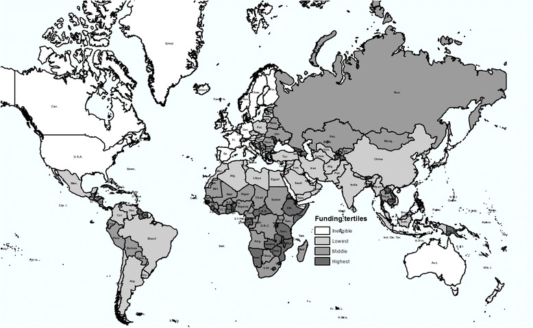
Geographical distribution of Global Fund support. Countries are shaded according to the tertile of per capita total Global Fund disbursements between 2002 and 2010, from lowest (lightest) to highest (darkest)

Geographical distribution of Global Fund support. Countries are shaded according to the tertile of per capita total Global Fund disbursements between 2002 and 2010, from lowest (lightest) to highest (darkest)