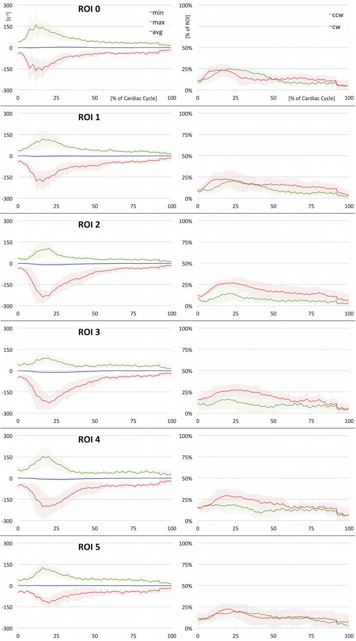
Fig 5. 2D Quantification (full).
Results of ROI based quantitative analysis (averaged over all healthy subjects). On the left, minimum, maximum, and average values of vorticity are plotted over time. These plots deliver insight into the vortex strength and rotational direction. On the right, the percentage of clockwise and counter-clockwise flow relative to the entire lumen is depicted. These plots deliver information on the amount of opposing rotational flow components. Underlying data of the diagrams is provided in S2 Data.

