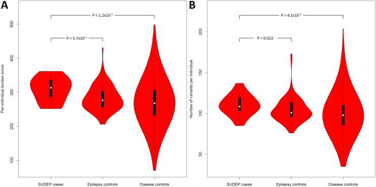
Fig. 2.
Violin plots of the burden score and variant number per individual. Plotted are the per-individual burden scores (A) and the number of variants per individual (B) of each test group. A violin plot is a box plot with the width of the box proportional to the estimated density of the observed data (proportion of cases with given ordinate value). The maximum density of the group-specific data distribution is indicated by the largest width of the violins. The density trace is plotted symmetrically to the left and the right of the box plot for better visualization. All violins have the same fixed maximum width. The white dot is the median, the thick black vertical bar represents the interquartile range (IQR), and the thin black vertical bar represents 95% confidence intervals.

