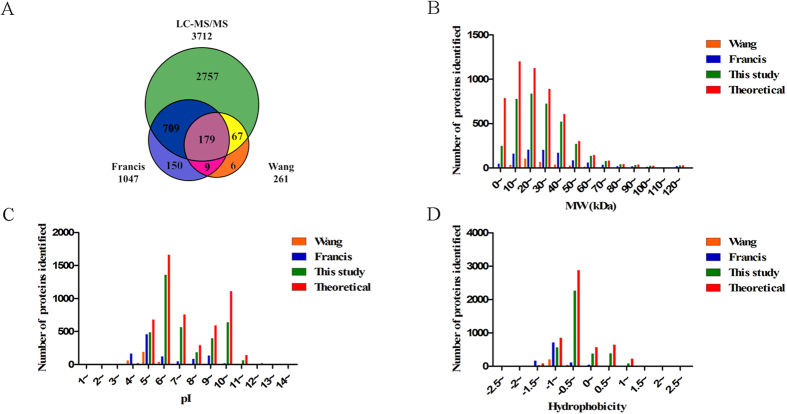
Figure 2. Comparison of proteome data sets.
(A) Venn diagram of unique and shared non-redundant identified proteins between the three datasets. (B) Molecular weight distribution. (C) pI distribution. (D) Hydrophobicity distribution. Red bar –theoretical proteins; green bar – this study; blue bar – Francis et al., orange bar – Wang et al.

