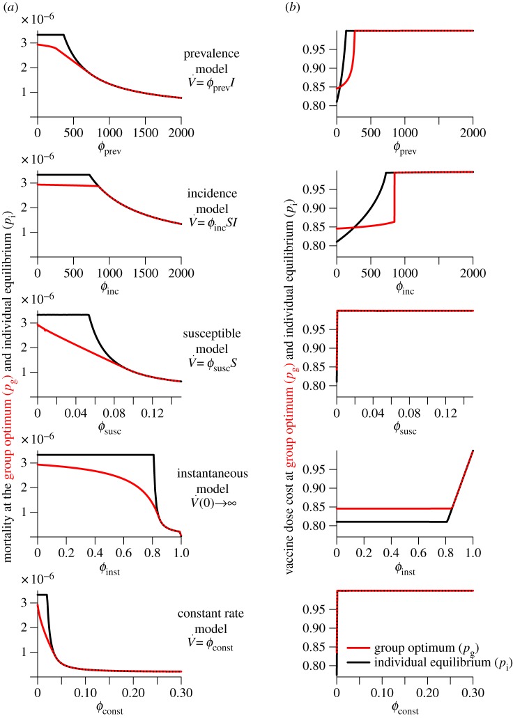
Figure 2.
Variation of the mortality cost (proportion of the population that dies) and vaccine dose cost (proportion of the population that is vaccinated by the end of the outbreak) as functions of the vaccination effort parameter  , for different vaccination models. Each row depicts the mortality costs (panel a) and vaccine dose costs (panel b), at the group optimum (red) and individual equilibrium (black) for one model. Note the different ranges of
  for different models. (Online version in colour.)

