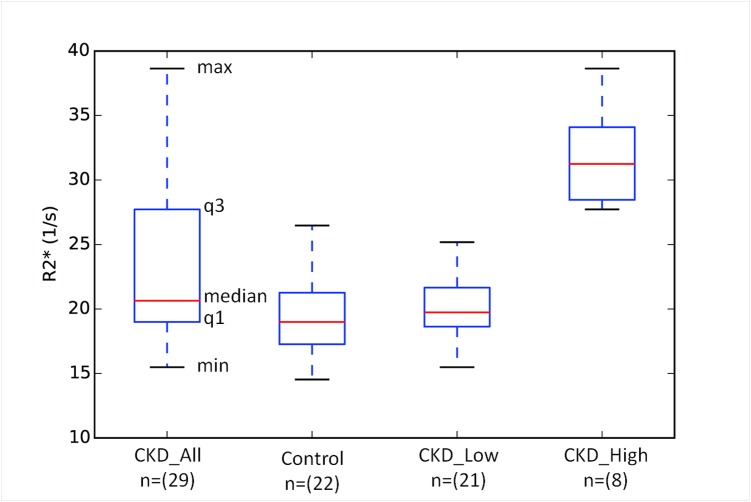
Fig 1. Box-and-whisker plots illustrating the distribution of R2* values in both CKD and control groups.
As shown in the annotations, the box-and-whisker plots represent five key values from the distribution (median (red line), 1st quartile (q1), 3rd quartile (q3), minimum and maximum values). For a normal distribution, the median value would be close to the center of the box. The plot for the CKD_All group clearly is skewed with the upper half showing much broader distribution. Also included are distributions separated by a threshold value of 27 s−1 (> maximum value in the control group). The CKD_Low group appears to be similar to the control group, while CKD_High is distinctly different.

