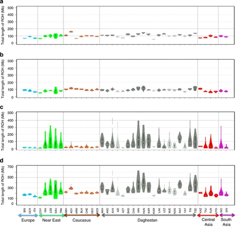
Figure 3.
Distribution of total length of different ROH classes per individual in 40 populations. A box plot and a kernel density plot are shown as ‘violin plots' for classes A (a), B (b), C (c) and A, B, C classes pooled together (d). The white horizontal line is the median, whereas the black bar represents the interquartile range. Populations are grouped according to geographic regions.

