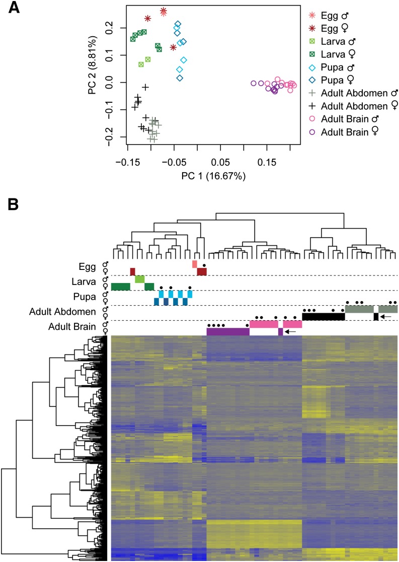
Figure 1.
Clustering of individuals based on overall patterns of gene expression. (A) PC plot for first two principal components and (B) heatmap and clustering of 400 genes with the most variable gene expression across samples (100 most variable genes from each of the first four principal components). Each row of the heatmap represents a single gene, and genes are clustered based on expression similarity. Dots above heatmap indicate individuals reared in the laboratory or placed in observation nests prior to collection (as opposed to collected from natural nests in the field). Blue and yellow colors in the heatmap correspond to low or high relative gene expression, respectively. Arrows refer to individual discussed in Principal component analysis section of Results and Discussion.

