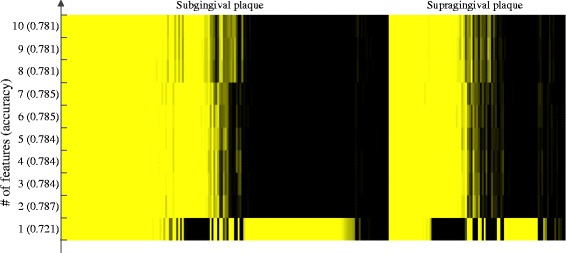
Fig. 6.

Classification of plaque samples using the 1–10 top-ranked features. The heatmap of times that samples were misclassified during 100 replicated runs. The rows correspond to the number of features used and the corresponding accuracy. Each column represents one sample, a yellow bar indicates a sample was misclassified in all 100 replicates, while a black bar indicates that a sample was correctly predicted in all replicates. Only those samples that were misclassified at least once are shown
