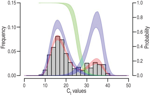
Fig. 1.

Finite-mixture modelling of the Ct value distribution and identification of the cut-off values. The number of samples with Ct <40 was 346 and is represented by the grey histograms. The best finite-mixture model was D1 with a log-normal distribution (left blue curve), and D2 with a Weibull distribution (right blue curve). This model is shown in red. From these latter two, the probability P of belonging to the left-most peak of Ct values is computed as D1/(D1 + D2) and this is shown by the green curve (see the right vertical scale). The widths of the curves indicate the 95% confidence intervals.
