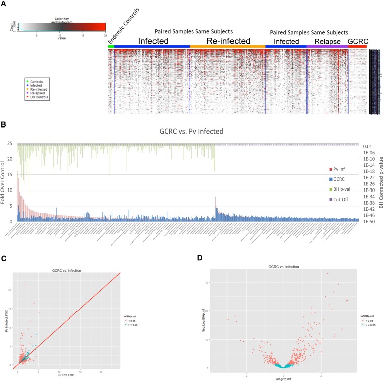
Figure 2.
Protein microarray analysis comparing serological responses of Plasmodium vivax relapse vs. reinfection. (A) Key to heat map, indicating color associated with signal intensity (left). Displayed at the left of the heat map are results of uninfected controls from the Iquitos region (“endemic controls”); the middle two panels of the heat map show results of paired, sequential samples from P. vivax infection of same subjects comparing total Infected (this category does not distinguish relapse from re-infection) vs. Re-infected; the right two panels of the heat map show results of paired, sequential samples from P. vivax infected-subjects that compare total Infected vs. Relapse (based on shared molecular genotyping—see Methods). (B) Protein microarray analysis of sera from first observed episode of Plasmodium vivax malaria. Recognized proteins are indicated with a green bars above them on the left side of the figure, where the P value is less than 0.05 (corrected for multiple measures by the Benjamini Hochberg test (BH) P value). All P. vivax-infected (relapse plus reinfection) are indicated by (Pv Inf) and negative controls are non-malaria infected individuals from the USA controls (GCRC, General Clinical Research Center). The full list of recognized proteins is in Supplementary Table 1. (C) Scatter plots with the GCRC mean fold over control (FOC) values on the x-axis, the mean P. vivax Infected FOC values on the y-axis and the identity line in red are graphed (Pv antigens with BH P values < 0.05 are colored in salmon and the others in cyan). (D) Volcano plots with the log2 (fold difference) on the x-axis and the −log10(BH P value) on the y-axis (P. vivax antigens with BH P values < 0.05 are colored in salmon and the others in cyan) to illustrate the difference in antibody profiles between the groups.

