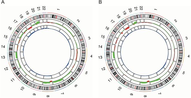
Figure 1.

Profile of CNAs and UPDs/UPPs from our study (A) and from the TCGA cohort (B). Chromosomes are represented in the outer ring of the circos plot. In the middle, gained regions are in green and lost regions in red. The inner ring shows frequency of UPDs/UPPs in blue. To note, regions with high frequency of UPD/UPP matched with regions with high frequency of copy number loss.
