. 2015 Aug 31;4:e10032. doi: 10.7554/eLife.10032

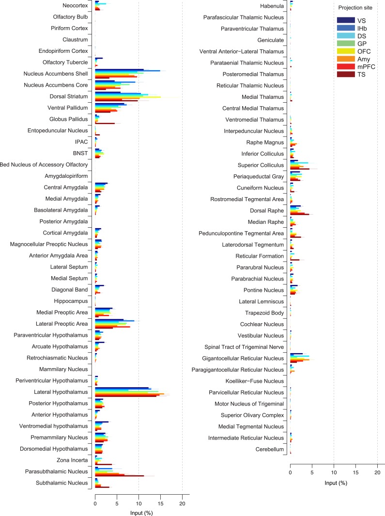
Figure 4. Comparison of the percentage of inputs from each region across populations of projection-specific dopamine neurons.

A summary of the distribution of inputs to dopamine neurons with different projection sites, with bars representing the average % of inputs observed (out of all labeled input neurons outside of the VTA/SNc/SNr/RRF) per region (mean ± s.e.m.). Each color represents inputs to a different population of dopamine neurons, as indicated in the inset. The 20 most prominent inputs are compared in Figure 4—figure supplement 1.

DOI: http://dx.doi.org/10.7554/eLife.10032.012

Figure 4.

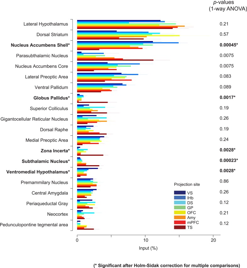
Figure 4—figure supplement 1. Comparison of the percentage of inputs from selected regions across populations of projection-specific dopamine neurons.

Figure 4—figure supplement 1.

A summary of the distribution of inputs among the 20 most prominent regions providing input to dopamine neurons. These areas were selected based on the maximum percentage of inputs among eight conditions for each area. Plots are identical to those displayed in Figure 4 and each condition is labeled with the same color as in Figure 4. p-Values are given based on 1-way ANOVA. Asterisks (*) indicate significant differences among conditions after Holm-Sidak corrections for multiple comparisons.