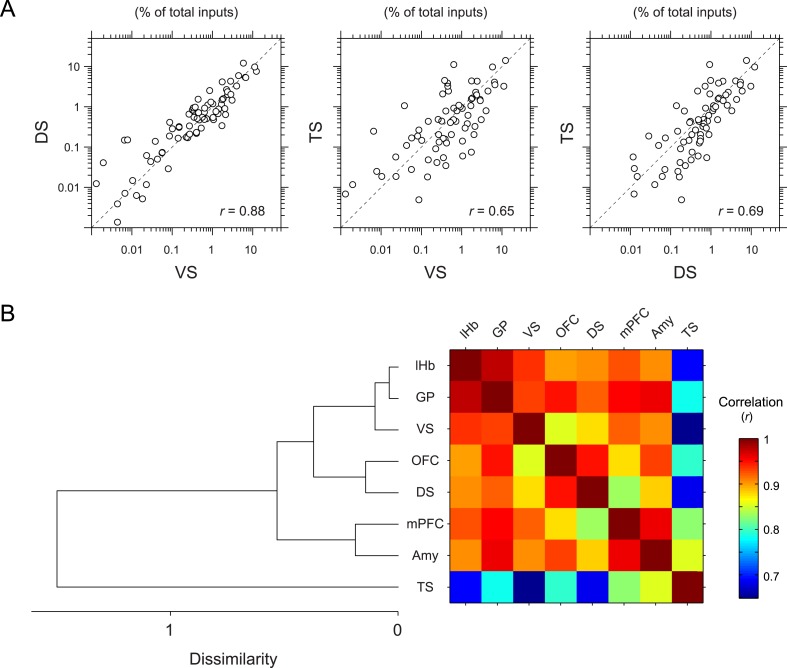
Figure 5. Correlation between projection-specific populations of dopamine neurons.
(A) Scatter plots comparing the percent of inputs from each anatomical region for VS-, DS-, and TS-projecting dopamine neurons. Each circle represents the average percent of inputs for one anatomical area for each condition. r: Pearson's correlation coefficient. The axes are in log scale. (B) Dendrogram (left) and correlation matrix (right) summarizing all pair-wise comparisons. Color on the right indicates correlation values. The dendrogram was generated based on hierarchical clustering using the average linkage function.

