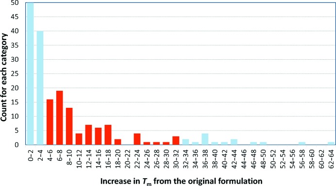
Figure 2.

Histogram of the best ΔT m for the samples that were subjected to the automatic analysis. The grey bars represent ΔT m values below 4° or over 30°, which were excluded from the calculation of how many samples might show an increased stability after changing the formulation. The low-end exclusions were made to ensure that the estimation of the chance of improvement is not artificially high by including samples where the ΔT m might be within the estimation of error of the T m of the ‘protein as supplied’ control (1 ± 3°). The high-end exclusions were made as visual inspection of these curves showed that these values were the result of the automatic analysis and were spurious. The remaining 92 samples (37%) showed on average a 12 ± 7° improvement in T m. Including the curves where ΔT m was above 2° increases the estimation of likelihood of improvement to 53%.
