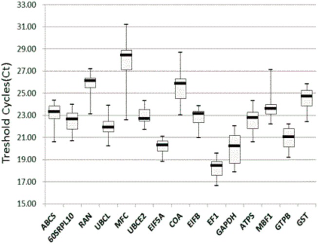
Fig 3. Threshold cycle (Ct) values of the candidate RGs across the experimental samples.

A box-plot graph of Ct values shows the median values as lines across the box. Upper and lower boxes indicate the 75th percentile to the 25th percentile. Whiskers represent the maximum and minimum values.
