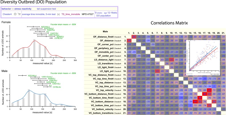
Fig. 5.

Diversity Outbred (DO). Individual measurements from DO populations can be viewed as a histogram as shown in the left panel. Females (red) are above and males (blue) below. The founder strains (green) are indicated above the histogram (mean ± SEM). There are plotting options available for this tool as well as output options (here we used eps). The right panel shows a screenshot of a correlations matrix for all pairwise measurements. Red values indicate positive correlations, blue indicated negative. The more intense the color, the stronger the correlation. Users can view detailed scatterplots (inset) by clicking on cells of the matrix. Correlation coefficients and p values are provided just below the scatterplot. Plot options are available for this tool. Data are from MPD project Chesler4 (Logan et al. 2013a, b)
