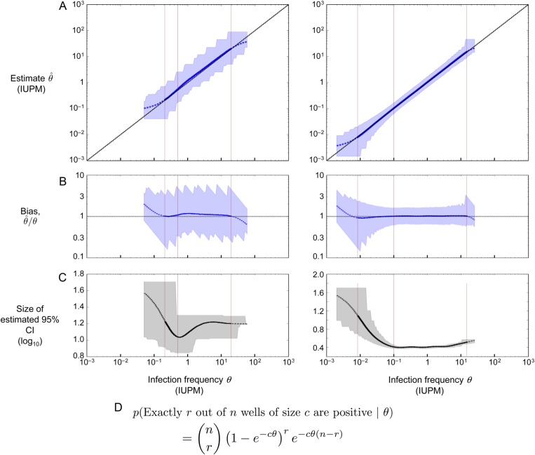
Figure 3.
Performance of the maximum likelihood estimator in simulations, using the two assay designs highlighted in Table 1. Left column: assay on row 4 (confidence interval [CI] < 1.5 logs); right column: assay on row 9 (CI < .5 logs). (A) Maximum likelihood estimate and 95% CI plotted in blue; the diagonal line shows the case of a perfect unbiased estimator. Asymptotic CIs are reported, using likelihood of log-transformed θ. (B) Bias plotted in blue; the horizontal line at 1 shows the case of a perfect unbiased estimator. (C) Size of the estimated 95% CI plotted in black (note different y-axis scales). (D) Binomial probability expression used to estimate infection frequency, assuming n replicate wells of c cells apiece. According to this expression, the probability that all wells are negative equals e−Cθ, where C is the total number of cells across all replicate wells. A–C plot the actual infection frequency used in simulations on the x-axis. Each point on the curves is the geometric mean (A and B) or arithmetic mean (C) of 20 000 replicate simulations using the same (step size 0.025 logs). Curves are solid where <5% of simulated assays yield all-negative or all-positive results, dashed at 5%–50%, and not shown at >50%. Blue (A and B) or gray (C) shaded regions show the middle 95% of simulations; jaggedness results from the discrete nature of the dilution assay. Left to right in each panel, the thin vertical lines show the LLD, the LLQ, and the ULQ = ULD. Note that the assay shown at right is more sensitive (20-fold lower LLD), more precise (narrower shaded regions in A and B, smaller CI in C), and more accurate (curve in A better tracks the diagonal; curve in B better tracks the horizontal).

