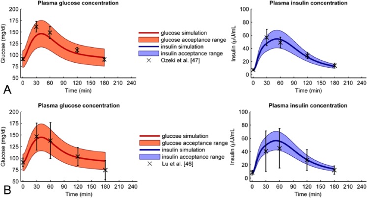
Figure 3.
(A) Best fitted verification data set. The data from Ozeki et al47 (crosses and error bars) are well predicted by the optimal model (solid line) since all data points lie within the acceptance range (filled area). The left graph shows the glucose data and model + acceptance range, the right graph shows the insulin data and model + acceptance range. (B) Worst fitted verification data set. Although the trend of the glucose data from Lu et al16 is predicted well (solid line), one glucose data point (crosses and errorbars) lies just outside the acceptable range (filled area). All insulin data points do lie within the acceptable range. The left graph shows the glucose data and model + acceptance range, the right graph shows the insulin data and model + acceptance range.

