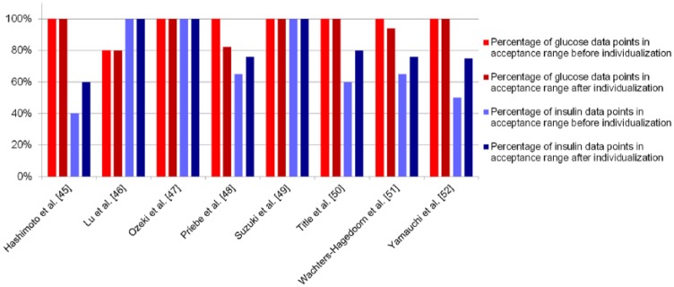
Figure 4.

Percentage of data points within the acceptance range, listed per verification data set. The red bars show the percentage of glucose data points within range before (light red) and after (dark red) individualization; the blue bars show the percentage of insulin data points before (light blue) and after (dark blue) individualization.
