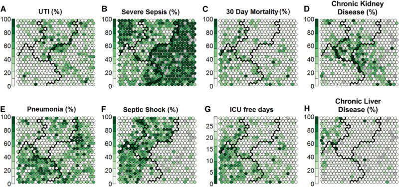
Fig. 3.

Distribution of variables not employed in clustering, across the nodes within each cluster. The clusters depicted here are the same as those depicted in Fig. 2. Each node on the map represents a group of patients and the value displayed represents the mean value of those patients. Within each node, the given value is represented by the darkness of the colour in the node. Each node is shaded from white to dark green, where darker colours represent higher average values (e.g., proportion of patients in that node with urinary infection as the cause of sepsis) among the patients in the given node. A cluster of patients with renal comorbidities is identified (d), which spreads over three clusters. In the pneumonia grid (e), two broad types are apparent: pneumonia with septic shock (f mainly in cluster 3) and pneumonia with severe sepsis (b mainly in cluster 2)
