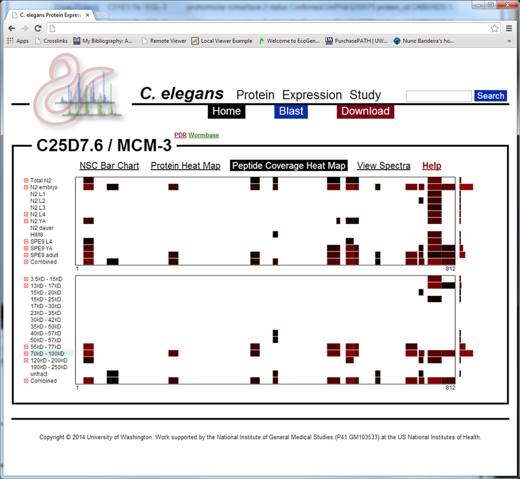
Figure 4.
A screenshot depicting the peptide coverage heat map for the MCM-3 protein—a protein known to affect embryonic viability. The x-axis represents the protein’s sequence laid out left-to-right from N- to C-terminus. The y-axis in the top graphic represents developmental stage and the y-axis in the bottom graphic represents mass fraction. The blue-shaded fraction represents the expected mass fraction for this protein. Each colored segment represents an area of sequence coverage specific to the respective developmental stage or mass fraction, and the color indicates the abundance of that observed peptide in NSC (brighter red indicates higher abundance). The bar-graph to the right of each section indicates the total abundance of protein for its respective row

