
Figure 4. Calibration plot, where the x-axis represents the predicted probability and the y-axis represents the observed fraction of prostate cancer in the validation cohort.
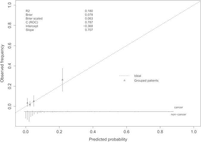
Instructions: The 45° dashed line represents ideal predictions, the triangle represents patient groups, the histogram at the bottom of the plots shows the distribution of outcomes, and the statistics at the upper left shows the model performance. The plot visualizes the proportion of patients falling within various predicted ranges when the nomogram is applied.