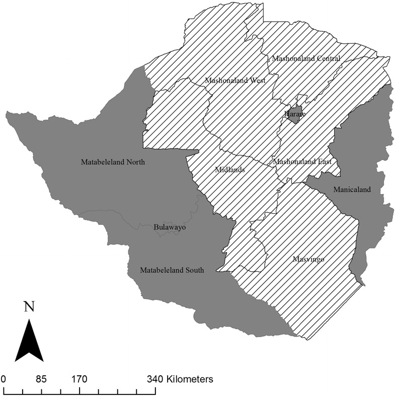
Fig. 2.

Map of provincial trends of sputum-smear positive (SSP) TB notification rates compared to the national SSP TB notification rate during 2008–2011. Grey regions represent provinces for which the average notification rate of SSP TB is above the national average; striped regions represent provinces for which the average SSP TB notification rate of is below the national average
