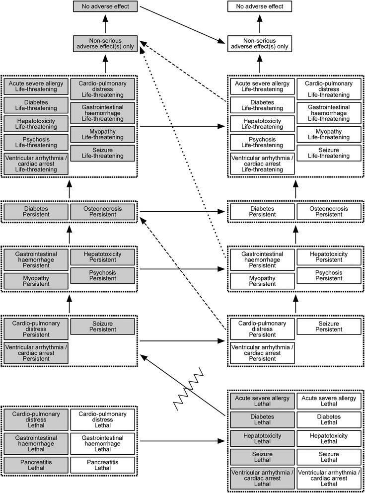
Fig. 6.

Results from the qualitative utility modelling. In the figure, grey boxes indicate clinical outcomes that include a standard relapse, i.e. no benefit, whereas white boxes signify a reduced relapse. The arrows point from a less desirable to more desirable clinical outcome. The two dashed arrows apply for patients starting their relapse at EDSS 4, and the dotted arrow for patients starting at EDSS 5. The zigzag line indicates a minimum utility difference between non-lethal and lethal outcomes
