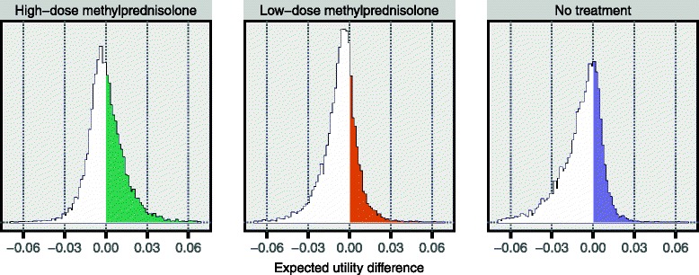
Fig. 9.

Resulting preference rates in one specific sensitivity analysis scenario. These histograms are based on the same results as those presented in Fig. 8. In each panel, the difference in expected utility was computed between the alternative indicated above the panel and the maximum expected utility for the other two alternatives. Using the left panel as an example, in each of the 10,000 iterations a difference was computed between the sampled expected utility for high-dose methylprednisolone and the highest expected utility of those sampled for low-dose methylprednisolone and the no treatment alternative. The 10,000 values for the difference thus obtained were then used to construct the displayed histogram. This means that the proportion of this histogram that is to the right of zero, i.e. the coloured proportion, is the fraction of all iterations in which high-dose methylprednisolone had the highest expected utility. Hence, this is precisely the preference rate for high-dose methylprednisolone, in this specific sensitivity analysis scenario. (See Fig. 1 for a definition of the preference rate.) Here, the preference rates are 45, 25 and 30 % for high-dose methylprednisolone, low-dose methylprednisolone and the no treatment alternative, respectively
