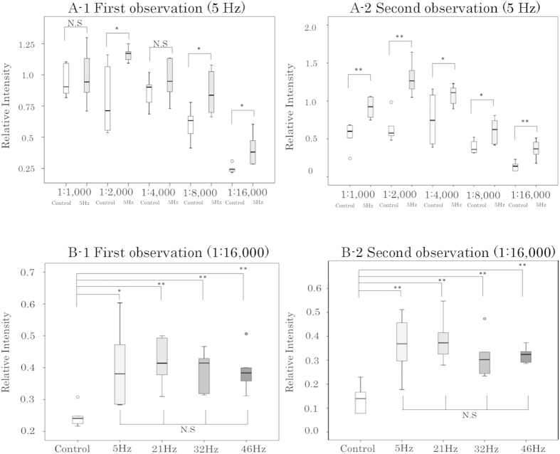
Figure 5. Box-and-whisker plots of Relative Intensity for each condition.
The bottom and top of each box mark the 25th and 75th percentiles, respectively. The whiskers are drawn down to the 5th percentile and up to the 95th. Points below and above the whiskers represent outliers. *P < 0.05, **P < 0.01, two-sample t-test or Welch’s t-test. N.S.: not significant. (A1) First observation comparing 5 Hz AC electric-field mixing with the control. (A2) Second observation comparing 5 Hz AC electric-field mixing with the control. (B1) First observation comparing AC electric-field mixing at 5 Hz, 21 Hz, 32 Hz, and 46 Hz with a non-mixed control at an antibody concentration of 1:16,000. (B2) Second observation comparing AC electric-field mixing at 5 Hz, 21 Hz, 32 Hz, and 46 Hz with a non-mixed control at an antibody concentration of 1:16,000. Comparisons between the four AC electric-field mixing groups were subjected to the Bonferroni correction for multiple comparisons.

