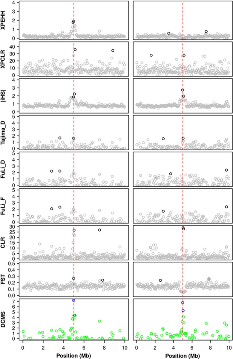
Figure 3.
Observed values of the eight test statistics and the combining strategy in two replicates of the simulated reference scenario. The red dashed lines indicate the position of the SNP under selection. In the left column, the statistic was calculated between the selected population and a no selection population (Sel vs noSel), while in the right column, both populations were under selection (Sel_1 vs Sel_2). The deep colored symbols represent the top 1% quantile of statistical scores for each statistic.

