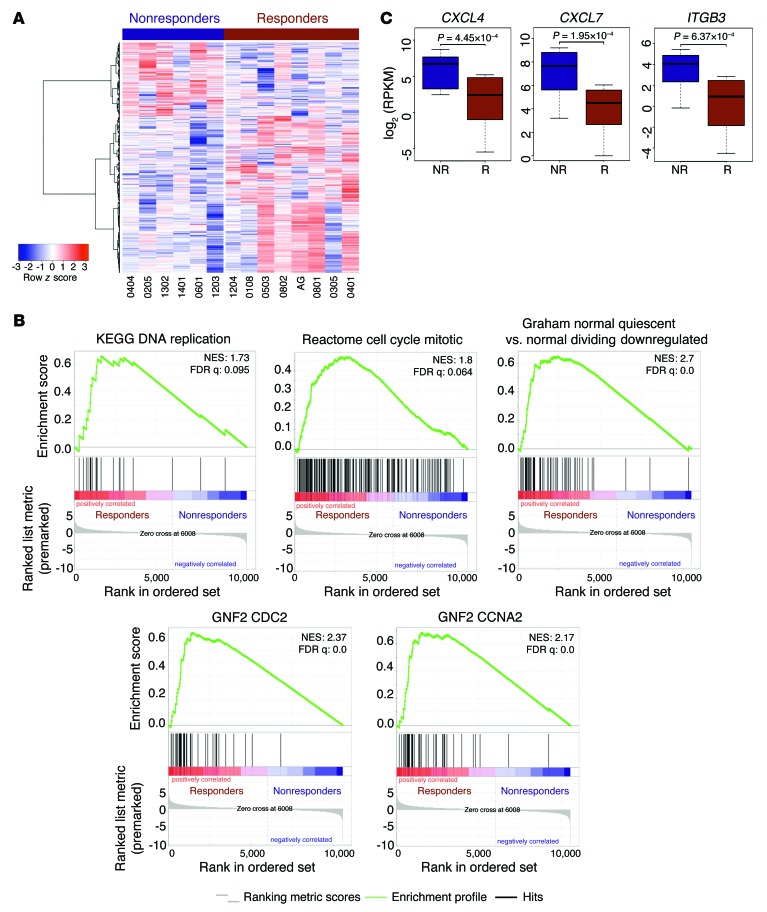
Figure 6. A specific transcriptional program is associated with response to DAC.
(A) Heatmap illustrates gene expression differences between 8 DAC-sensitive (indicated by the red bar) and 6 DAC-resistant patients (indicated by the blue bar). Genes represented in the heatmap were identified by a GLM likelihood ratio test (P < 0.05 and absolute log2 fold change >1). (B) Enrichment plots for GSEA using the expression difference–ranked gene list showing enrichment for cell cycle–related gene sets. NES, normalized enrichment score. (C) Box plots showing gene expression differences for CXCL4, CXCL7, and ITGB3 (red box plots denote responders; blue box plots denote nonresponders). P values were obtained from a GLM likelihood ratio test.

