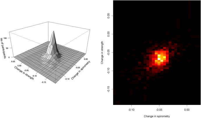
Figure 2.
Annual rates of change in SPI and RMS. On the left is a two-dimensional histogram of annual rates of change in SPI and RMS estimated by simultaneous random effects model (Table 2). The figure on the right depicts the density of the number of participants shown in the two dimensional histogram with yellow showing increased density compared to the shades of red. X axis shows change in SPI and Y axis shows the change in RMS. In both portions of the figure, each point illustrates the person-specific change in both aspects of respiratory function. As can be seen on the right, nearly all values are less than zero, for SPI and RMS since both declined in nearly all cases.

