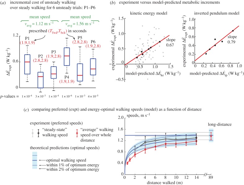
Figure 2.
(a) Difference  between oscillating- and constant-speed walking metabolic rates for six oscillating-speed trials (P1–P6): three (Tfwd,Tbck) combinations and two mean speeds. Box plot shows median (red bar), 25–75th percentile (box), and 10–90th percentile (whiskers); p-values use one-sided t-tests for the alternative hypothesis that metabolic rate differences are from a distribution with greater-than-zero mean. (b)
  compared with kinetic energy model
  and inverted pendulum model
  we show experimental and model means (black filled circles), the best-fit line (red, solid) and all subjects' trials (scatter plot, grey dots); no scatter plot for inverted pendulum model as it produces only one prediction per trial. (c) Distance-dependence of the model-based energy-optimal walking speeds (blue, solid) and experimentally measured preferred speeds (red and black error bars). Ranges of model-based energy-optimal speeds within 1% (blue line, thin) and 2% (blue band) of optimal energy cost are shown. We show whole-bout ‘average' speeds (red) and ‘steady-state' speeds over middle 1.42 m (black, thick), indistinguishable from over middle 0.75 m (grey, thin). Average preferred speeds for 0.5–14 m trials were significantly lower than that for the 89 m trial (paired t-test, p < 0.01); similarly, the ‘steady-state' speeds for 2–6 m were significantly lower than that for 89 m (paired t-test, p < 0.04).

