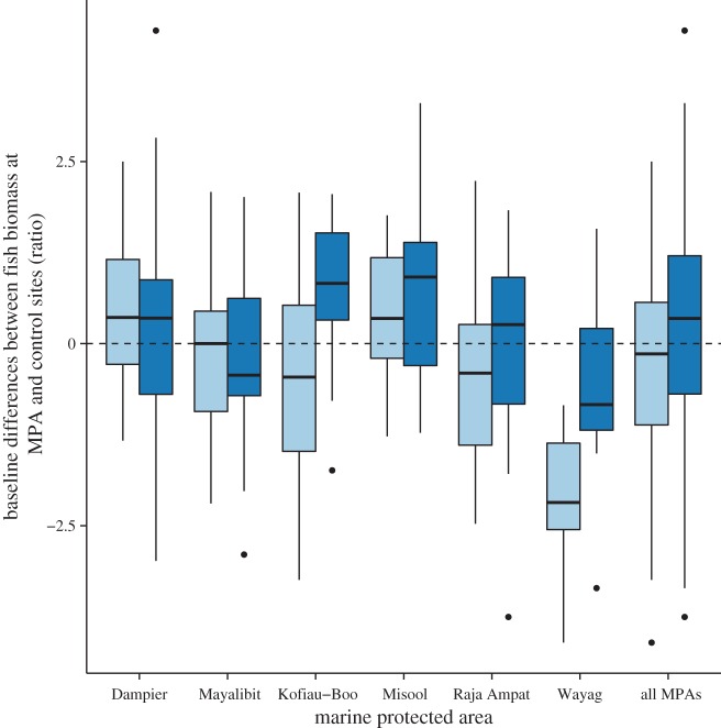
Figure 2.
Baseline differences in the fish biomass of key fisheries (dark blue) and functional fish groups (light blue) within MPAs versus outside MPAs in the BHS, shown as ratios of biomass from matched MPA (inside) and control (outside) site pairs. Ratio more than 0 indicate biomass at MPA sites more than control sites. Each boxplot shows the distribution of ratios for individual MPAs; ratios were also pooled to show the overall distribution across the seascape (All MPAs). The shaded box represents the interquartile range; the black line within the shaded box is the median value; whiskers indicate maximum and minimum values excluding outliers; dots represent outliers (more than 1.5 times upper quartile).

