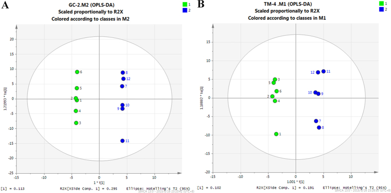
Figure 4. OPLS-DA score plots for GC/MS data.

The green circle represents the control group, and the blue circle represents the THS treatment group. (A) OPLS-DA score plot showed good discrimination between the THS treatment and control groups in GC-2 cells. (B) OPLS-DA score plot showed good discrimination between the THS treatment and control groups in TM-4 cells.
