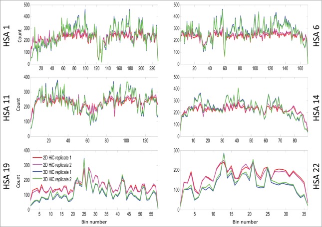
Figure 5.
This line plot shows the intra-bin Hi-C counts after RPM normalization within each mega base generated from 2D cells and 3D spheroids. On the X-axis are the coordinates of DNA sequence in mega base from pter to qter of each correspondence chromosome. The Y-axis indicates the diagonal bin counts. Lines in blue and cyan indicate counts for spheroids, and lines in red and magenta represent counts from 2D cells. Increased bin-wise counts in spheroids are seen in large regions on HSA 1, 6, 11, 14, and decreased bin-wise counts in spheroids are seen on HSA 19 and 22. If you want to include ICE figures, the figure legend will be nearly the same – simply indicate that ICE and RPM were applied before the analyses.

