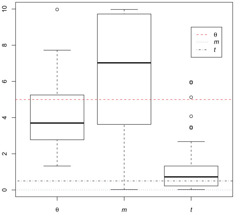
Figure 1.
Box plots of estimates of θ, m and t for 100 simulated data sets. In each panel the boxed area includes the interquartile range (IQR) from the first to the third quartiles, with the black thick line showing the median value. Whiskers indicate 1.5 IQR away from either the lower and upper quantiles, with outliers shown using circles. Dotted colored lines show the true values used for the simulations.

