
Fig. 1.
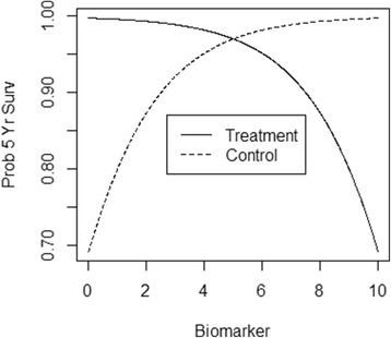
A predictive biomarker example. The solid line shows the probability of 5-year survival under treatment; as the biomarker value increases from 0 to 10, the probability of survival decreases. The dashed line shows the probability of 5-year survival under a control; as the biomarker value increases from 0 to 10, the probability of survival increases. The optimal therapy is: treatment those with biomarker value below 5, and do not treat those with biomarker value above 5