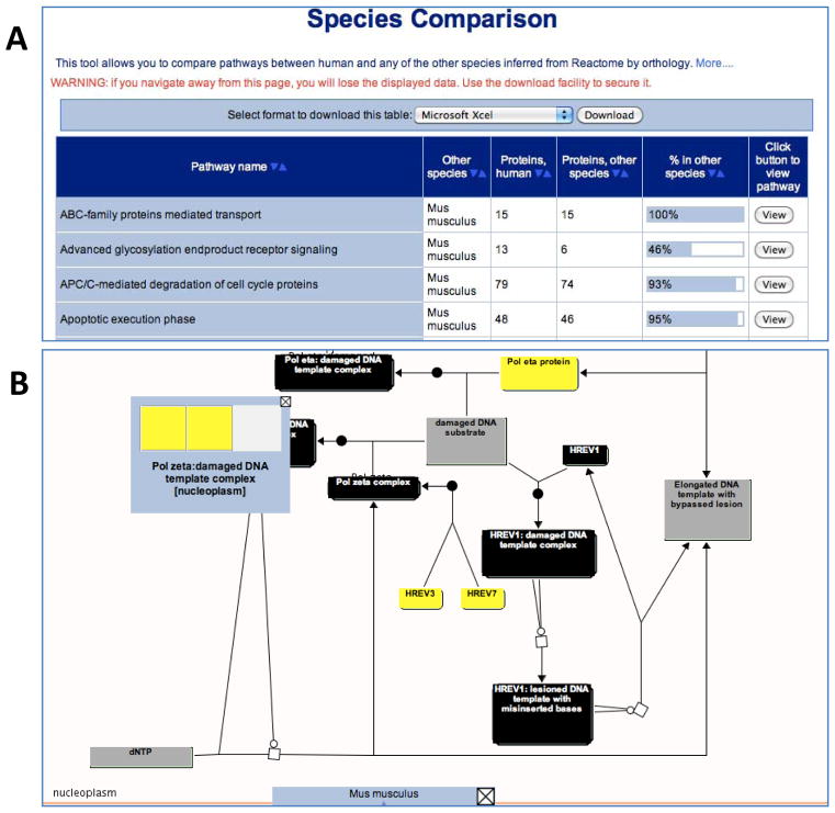
Figure 6.
Species Comparison Tool. (A) Results for the comparison of human and mouse pathways. Each row in the table is a pathway; the columns are pathway name, model organism name, number of proteins in the human pathway, number of orthologous proteins in the inferred model organism pathway, a graphical representation of the ratio of these two values, and a “View” button that creates a pathway diagram. ‘Sort” buttons at the top of each column allow the table to be re-ordered according to cell contents in that column. (B) The pathway browser displaying the comparison of the human and mouse DNA Damage Bypass pathways. Physical entities in the pathway diagram are colour-coded: gray, no match; black, a complex (multicomponent) entity; and yellow, the protein’s ortholog is present in human.

