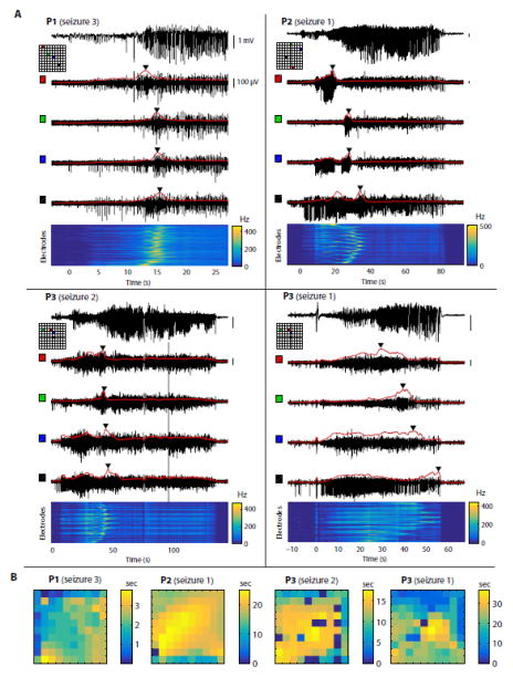
Figure 1. Seizure propagation dynamics are complex and variable across patients.
(A) Each panel represents a different patient/seizure. On each panel, the top trace shows LFPs (0.3–300 Hz) recorded from a representative electrode. The 4 black traces below show high-pass MUA (300 Hz – 7.5 kHz) from 4 electrodes located on the MEA at the positions indicated on the corresponding map (each electrode is associated with a color shown both on the map and next to the corresponding trace). The red curve overlaid with each MUA trace shows the rate of thresholded MUA (4 standard deviations above or below the mean, binned in 1-s overlapping time windows). Triangular markers indicate the time when the MUA rate reaches a maximum on each electrode. At the bottom, the heat map represents the MUA rate over time (x-axis) and across electrodes (y-axis, ordered row-wise across the MEA). (B) Delay maps of the peak of MUA rate. For each example shown in (A), the peak of MUA rate on each electrode was identified, and the latency with respect to the earliest electrode was plotted as a heat map. The 1st example (P1, seizure 3) reveals propagation resembling a plane wave, but the 3 other examples show more complex or unclear propagation patterns.

