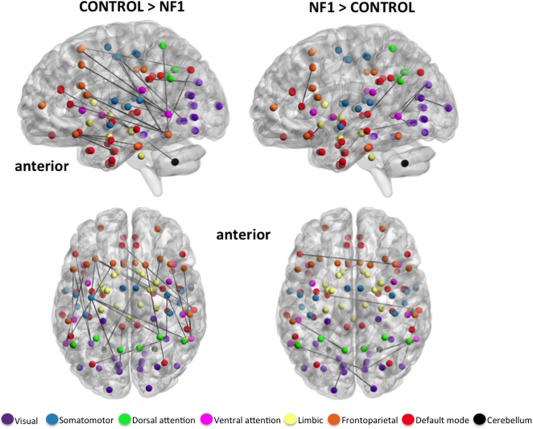
Figure 2.

Axial and medial view (left hemisphere) of significantly stronger edges in healthy controls (left) and participants with NF1 (right), indicating relatively greater anterior–posterior connectivity in controls vs NF1 participants. Spheres represent the center coordinate of brain regions from the Harvard–Oxford atlas, and black lines represent exclusive maps of edges that exist in each cohort. Spheres are colored to demonstrate membership to one of seven functional networks derived from resting state studies of 1000 subjects [Yeo et al., 2011]. All edges are significant at FDR 10% corrected for multiple comparisons. [Color figure can be viewed in the online issue, which is available at http://wileyonlinelibrary.com.]
