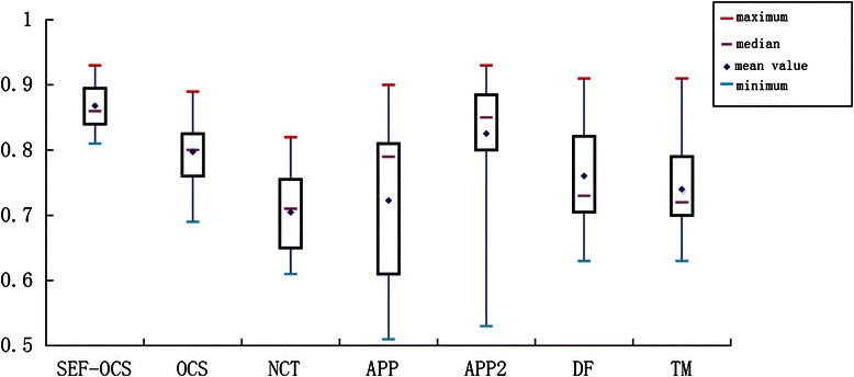
Fig. 12.

The box plot of DIADEM scores of the different methods for different datasets (OP_1 to OP_9 and NC_1 to NC_6 datasets). The median is the middle pink bar. The box indicates the lower quartile (splits 25 % of lowest data) and the upper quartile (splits 75 % of highest data). The red bar and blue bar are the maximum and minimum values. The blue diamond denotes the mean value of the scores
