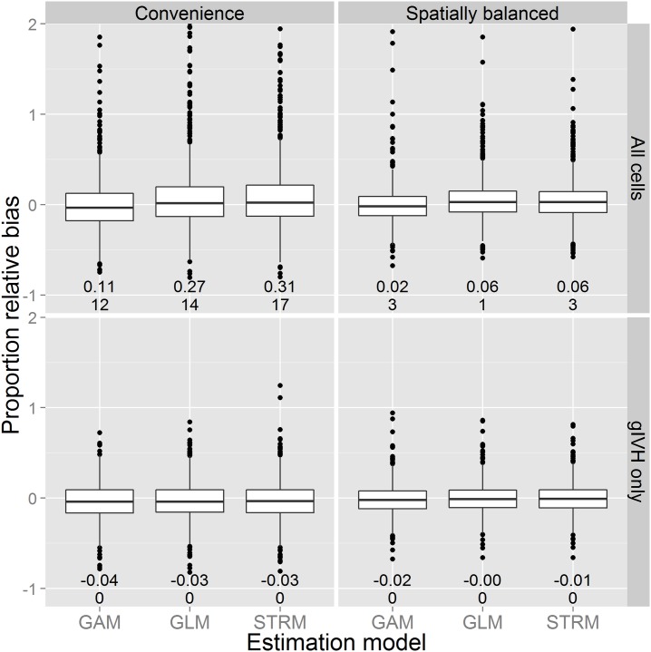
Fig 6. Boxplots summarizing proportional error in abundance from the simulation experiment.
Each boxplot summarizes the distribution of proportional error in the posterior predictive median of abundance as a function of estimation model (x-axis), survey design (columns) and whether or not inference was restricted to the gIVH (rows). The lower and upper limits of each box correspond to first and third quartiles, while whiskers extend to the lowest and highest observed bias within 1.5 interquartile range units from the box. Outliers outside of this range are denoted with points. Horizontal lines within boxes denote median bias. The two numbers located below each boxplot indicate mean bias (upper number) and the number of additional outliers for which proportional bias was greater than 2.0 (lower number).

