
Figure 2.
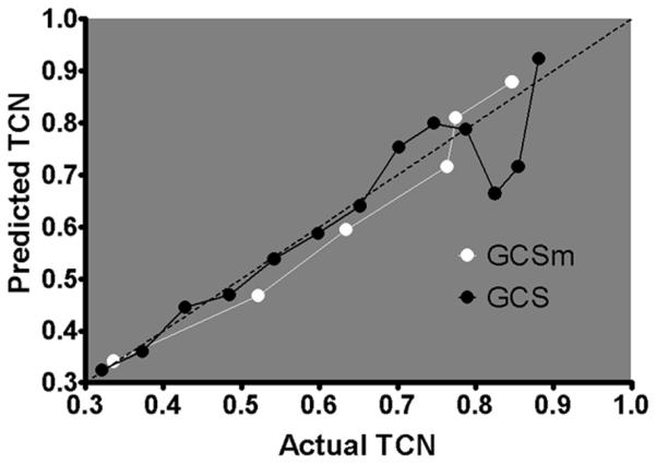
Predicted TCN plotted versus actual TCN through the range of scores for GCS (3–15) and GCSm (1–6). The dotted diagonal line represents perfect calibration. The more linear line of the GCSm model indicates calibration better than that of the GCS model through the range of scores to predict TCN, particularly at the lower end of the scales.