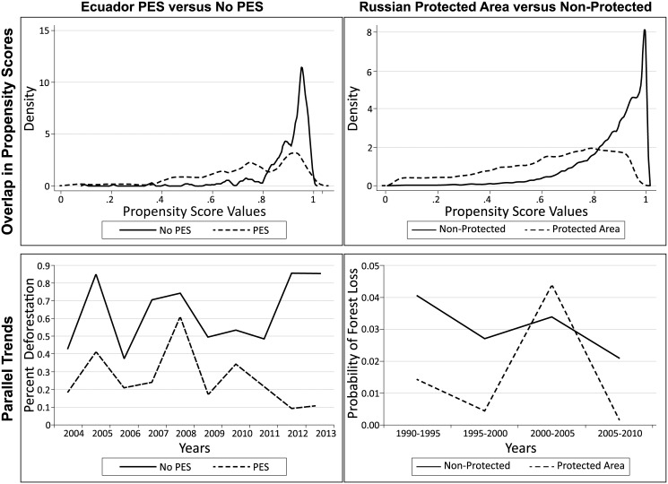
Fig 2. Goodness of Fit Tests.
Overlap in propensity scores is calculated in Stata 13; it shows the distribution of propensity scores across treatment and control observations. Parallel trends are graphed for both treatment and control groups before matching. A test for statistical differences in trends was estimated using fixed effects regression. After matching, trends become more similar, and are not shown here.

