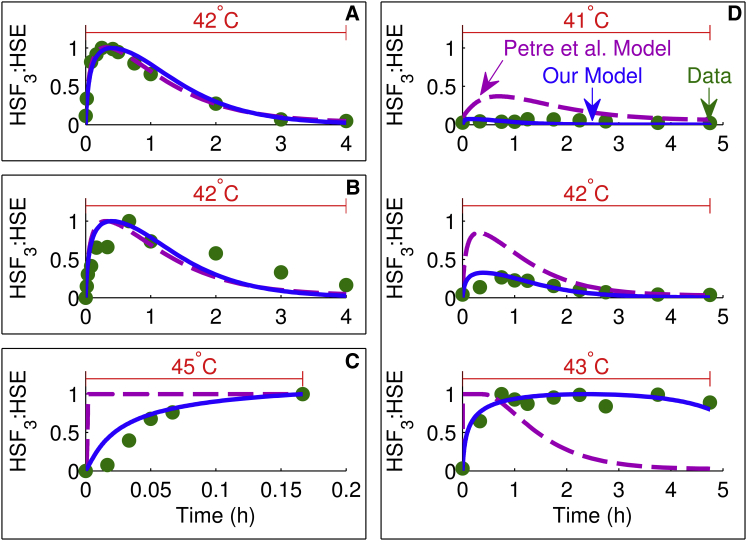
Figure 2.
Comparison of model simulations with HSF DNA-binding data. Each plot shows the heat-stress temperature at the top, experimental data (circles), our model simulation (solid line), and model simulation of Petre et al. (16) (dashed line). Each box enclosing one or more plots is denoted by a letter and represents either one experiment or experiments from the same study plotted on the same scale: (A) (23), (B) (10), (C) (22), and (D) (10). To see this figure in color, go online.

